Best Fonts for Video Content: Enhance Clarity and Impact
Discover the best fonts for video content to boost readability, grab attention, and strengthen your brand across all digital platforms.
Best Fonts for Video Content: Enhance Clarity and Impact
Picking the right font for your video seems simple, but it can make or break your message. Some fonts might look stylish, yet research shows that complex typography can actually drive viewers away and increase dropout rates by up to 30 percent. So the secret to powerful video content is not a trendy font, but a straightforward one that keeps people watching till the end.
Table of Contents
- How Font Choice Impacts Video Content
- Top Font Styles For Clear On-Screen Text
- Tips For Pairing Fonts And Maintaining Brand Consistency
- Practical Advice For Using Fonts In Video Editing
Quick Summary
| Takeaway | Explanation |
|---|---|
| Choose legible sans-serif fonts | Sans-serif fonts like Arial and Helvetica enhance readability and viewer engagement, especially in video content. |
| Maintain brand consistency in typography | Using a limited selection of fonts that align with your brand strengthens your visual identity and aids recognition. |
| Focus on appropriate font sizing | Text should be sized for clarity, especially for diverse audiences, with recommendations of at least 12-point size for visibility. |
| Pair fonts strategically for impact | Effective font pairings create visual interest and maintain hierarchy, making text more engaging and easier to read. |
| Consider text placement for readability | Proper positioning and contrast are essential in video to avoid distraction and enhance viewer comprehension. |
How Font Choice Impacts Video Content
Font selection goes far beyond aesthetic preferences in video content. It directly influences viewer comprehension, engagement, and overall message retention. Understanding the psychological and visual impact of typography can transform how audiences perceive and interact with your video materials.
The Visual Psychology of Typography
Fonts are not merely decorative elements. They communicate subtle messages about brand personality, content tone, and professional credibility. Research from the National Institutes of Health emphasizes that typography choices significantly affect readability and comprehension, advising creators to prioritize clarity over stylistic complexity.
The cognitive load placed on viewers increases with challenging font designs. A complex or illegible typeface can distract audiences from your core message, causing them to spend more mental energy deciphering text rather than absorbing content. A comprehensive study on educational video interactions revealed that increased visual complexity, particularly in textual elements, correlates with higher viewer dropout rates and more frequent video pausing.
Legibility and Viewer Engagement
Consider how font characteristics impact viewer experience. Sans-serif fonts like Arial or Helvetica typically offer superior readability on digital screens, presenting clean lines that reduce visual strain. Interesting research involving special education students demonstrated a clear preference for sans-serif typography. In a study examining font legibility, participants showed markedly reduced restlessness when presented with easier-to-read font styles.
Key considerations for font selection include:
- Readability: Choose fonts that remain clear at multiple sizes
- Screen Compatibility: Select typefaces designed for digital display
- Brand Consistency: Align font choices with overall visual identity
The wrong font can create unintended psychological barriers. A playful, handwritten font might work brilliantly for a children's tutorial but could undermine credibility in a professional training video. Each font carries inherent emotional weight and communicational nuance.
Professional video creators understand that typography is a strategic communication tool. It's not just about looking good—it's about creating an seamless, intuitive viewing experience that keeps audiences engaged and informed. By carefully selecting fonts that enhance rather than obstruct your message, you transform text from a mere visual element into a powerful narrative companion.
Remember, in the world of video content, your font is speaking volumes before a single word is read.

Top Font Styles for Clear On-Screen Text
Selecting the right font for on-screen text is crucial for creating professional and easily digestible video content. Different font styles can dramatically impact viewer comprehension and engagement, making strategic typography a key consideration for content creators.
Sans-Serif Fonts: The Digital Display Champions
Harvard University's Digital Accessibility guidelines strongly recommend using sans-serif fonts for superior legibility, especially in digital environments. These fonts feature clean, straightforward letterforms without decorative extensions, making them ideal for video text overlays and captions.
Top sans-serif fonts that excel in video content include:
Here is a comparison table summarizing the strengths and optimal uses of the top fonts recommended in the article for video content:
| Font Name | Type | Strengths | Recommended Use |
|---|---|---|---|
| Arial | Sans-serif | Universally recognized, highly readable | Any on-screen text, captions |
| Helvetica | Sans-serif | Clean lines, professional appearance | Professional or corporate videos |
| Tahoma | Sans-serif | Compact, excellent at small sizes | Lower-thirds, smaller text overlays |
| Neutraface | Sans-serif | Modern, geometric, brand-friendly | Institutional/brand-aligned videos |
| Kepler | Serif | High readability for longer text segments | Extended captions or explanations |
| Avenir | Sans-serif | Contemporary, versatile | Marketing, adaptable to various styles |
- Arial: A universally recognized font with exceptional clarity
- Helvetica: Known for its clean lines and professional appearance
- Tahoma: Compact design that works well in smaller text sizes
The U.S. Department of Health and Human Services specifically advises using sans-serif fonts in at least 12-point size to enhance readability. This recommendation is particularly important for viewers with limited literacy skills or older audiences who may struggle with more complex typefaces.
Professional Branding Through Typography
Beyond readability, font selection plays a critical role in brand communication. SUNY Geneseo's Video Style Guide emphasizes the importance of consistent typography in maintaining visual identity. Professional video creators often select specific fonts that align with their brand's personality and messaging.
Recommended professional fonts for video content include:
- Neutraface: A modern, geometric sans-serif font ideal for institutional videos
- Kepler: A versatile serif font with excellent readability for longer text segments
- Avenir: A clean, contemporary font that works well across different video styles
When selecting a font, consider factors beyond mere aesthetics. The right typeface should complement your content's tone, enhance readability, and reinforce your brand's visual identity. A well-chosen font can subtly communicate professionalism, creativity, or approachability without drawing attention away from your core message.
Remember that font selection is not a one-size-fits-all approach. Different video types—educational content, marketing materials, social media clips—may require nuanced typography strategies. Test multiple fonts, evaluate their performance, and don't be afraid to experiment to find the perfect visual representation of your content.
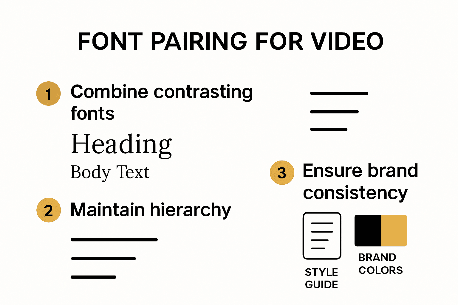
Tips for Pairing Fonts and Maintaining Brand Consistency
Font pairing is an art form that goes beyond simple aesthetic selection. It requires strategic thinking about visual hierarchy, readability, and brand communication. When done correctly, font combinations can elevate video content from mundane to memorable.
Understanding Font Hierarchy and Compatibility
WebAIM, a leading authority on accessible design, emphasizes the critical importance of creating harmonious font relationships that maintain both visual interest and brand integrity. The key is selecting typefaces that complement each other while serving distinct communicative purposes.
Successful font pairing involves understanding fundamental typographic principles. Typically, this means combining fonts with contrasting characteristics—perhaps a bold sans-serif headline paired with a clean, readable serif body text. This approach creates visual dynamism while ensuring that each font type performs its specific role effectively.
Consider these strategic pairing principles:
- Contrast: Choose fonts with different weights and styles
- Readability: Ensure each font remains legible at various sizes
- Thematic Alignment: Select fonts that reflect your brand's personality
Establishing Visual Brand Identity
Brand consistency is more than maintaining the same color palette. Typography serves as a silent communicator of your brand's essence. Each font selection sends a subtle message about your organization's character—whether professional, creative, minimalist, or dynamic.
When developing a comprehensive typography strategy, consider these critical factors:
- Limit Font Varieties: Use no more than two or three complementary fonts
- Create Style Guidelines: Document precise font usage rules
- Maintain Consistent Sizing: Establish clear hierarchical text measurements
Video content requires particular attention to font selection. Unlike static designs, video introduces motion, screen transitions, and dynamic viewing environments. Your chosen fonts must remain legible and visually appealing across different display contexts and screen sizes.
Professional video creators understand that typography is not merely decorative—it's a strategic communication tool. A well-conceived font pairing can transform ordinary text into a powerful narrative element that guides viewer attention and enhances message comprehension.
Remember that font selection is an iterative process. Experiment with different combinations, test them across various video formats, and be prepared to refine your approach. Your typography should evolve alongside your brand, always maintaining a balance between innovation and recognizability.
Practical Advice for Using Fonts in Video Editing
Successful font implementation in video editing requires more than aesthetic considerations. It demands strategic placement, careful timing, and precise technical execution to ensure maximum viewer comprehension and engagement.
Typography Placement and Readability
Harvard's Digital Accessibility guidelines provide critical insights into effective text presentation. They recommend keeping body text width between 60-100 characters per line and maintaining generous line height for optimal readability. In video contexts, this translates to carefully considering text overlay size, positioning, and duration.
Key technical considerations for font placement include:
- Safe Areas: Position text within title and action safe zones
- Contrast: Ensure text stands out against background visuals
- Movement: Avoid text that competes with on-screen action
Accessibility and Design Consistency
The CDC's presentation guidelines recommend the '2 x 2 rule': using no more than two font types and two font sizes per video segment. This approach maintains visual consistency and prevents viewer cognitive overload.
SUNY Geneseo's Video Style Guide emphasizes additional critical practices:
- Captioning: Ensure all web-hosted videos include closed captions
- Text Duration: Keep text on screen long enough to be fully read
- Brand Consistency: Use designated fonts like Neutraface for institutional content
Professional video editors understand that font usage extends beyond mere text display. It's about creating a seamless visual narrative where typography serves as a silent guide, directing viewer attention and enhancing content comprehension.
Consider the technical nuances of font implementation. Different video platforms and screen sizes require adaptive typography strategies. A font that looks crisp on a high-resolution monitor might become illegible on a smartphone screen. Always test your text overlays across multiple devices and display contexts.
This checklist table helps ensure you follow best practices for typography, branding, and accessibility when editing video content:
| Practice | Description | Essential? |
|---|---|---|
| Limit font types/sizes | Use no more than two fonts and two sizes per segment | Yes |
| Position text in safe zones | Keep text within title/action safe areas | Yes |
| Ensure high contrast | Text should stand out clearly from the background | Yes |
| Use closed captions | All web-hosted videos must include captions | Yes |
| Size text for visibility | At least 12-point; large enough for all audiences | Yes |
| Maintain brand consistency | Use designated fonts and style guidelines for your brand | Yes |
| Allow sufficient text duration | Keep text on screen long enough to be fully read | Yes |
| Test across devices/platforms | Preview font on multiple screens for clarity and legibility | Yes |
Remember that font editing is a delicate balance between aesthetic appeal and functional clarity. Your goal is to create text elements that enhance—not distract from—your video's core message. Experiment, seek feedback, and continuously refine your typographic approach to create truly professional visual content.
Frequently Asked Questions
What types of fonts are best for video content?
Sans-serif fonts are generally the best choice for video content due to their high readability and clean lines. Popular options include Arial, Helvetica, and Tahoma, which present a clear message without visual complexity.
How does font choice impact viewer engagement in videos?
Font choice significantly affects viewer engagement; complex or hard-to-read fonts can lead to increased dropout rates. Choosing legible, straightforward fonts keeps audiences focused on the content rather than struggling to read text.
What is the recommended font size for text in videos?
It is recommended to use at least a 12-point font size for text in videos to ensure visibility, especially for diverse audiences including those with limited literacy skills or visual impairments.
How can I ensure brand consistency with my fonts in video content?
To maintain brand consistency, select a limited number of fonts that align with your brand identity. Create style guidelines that specify font usage, sizes, and combinations to ensure visual uniformity across all videos.
Make Your Video Fonts Shine With Smart AI Video Creation
Struggling to keep your text clear, professional, and on-brand in every video? If you have ever worried about readability, strong brand identity, or making the right font choice, you are not alone. The right typography can boost viewer engagement and build trust, but achieving perfect text placement, sizing, and consistency is often overwhelming without the right tools.
You do not have to overthink your next video project. On Palmedor.ai, you can generate cinematic, high-impact videos where your fonts remain crisp, on-brand, and easy to read. Our platform handles script writing, scene management, and even smart text overlays tailored to your content and audience. Try creating a demo video today. See how effortless it is to transform your message with professional fonts and seamless design. Stop losing viewers to confusing visuals and make your work shine now.